Sketching a Scene: A visual history of Scottish clubbing
From early Slam events to pre-pandemic parties, we delve into the visual history of Scottish club culture with help from some notable club flyer and poster designers

Sometimes we are transported back to a particular night without warning. It might be spurred on by a dog-eared ticket found down the back of the sofa, or the remains of a poster peeking through a papier-mâchéd wall on the Cowgate. It could be an illustration you see while scrolling through Instagram, or the face of a stranger who once handed you a soggy flyer on Sauchiehall Street.
Providing visual references for nights that may otherwise feel hazy with memory, graphic designers form an integral part of the clubbing ecosystem. Gone are the primitive days of posters made exclusively with felt tip pens and a photocopier; as digital design software has become more accessible, club artwork has grown increasingly varied and innovative.
Back to Basics
The house and techno explosion that was born in the United States made its way over to Scotland in the mid-1980s, back when posters disguised as adverts for car MOTs disclosed vital details for illegal raves. By the end of the decade, the underground electronic dance scene had fully infiltrated the commercial world. Block colours, geometric shapes, and simple motifs were popular in posters, and balancing a huge amount of event information with an eye-catching design was essential.
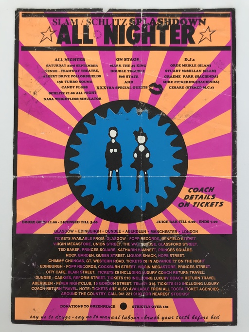
Wendy Helliwell is a mixed-media artist from Edinburgh with a vast collection of original flyers from late 80s and early 90s club nights. She references a poster for a 1989 Slam Splashdown all-nighter at Tramway in Glasgow (pictured below). “I’m pretty certain that was one of Scotland’s first legally organised raves,” she says. The poster is dense with information, packed with every ticket vendor in the country, coach departures, line-up listings, as well as promises of candy floss, a juice bar, and a ‘NASA weightless simulator’. “There were bus loads coming up from the Haçienda in Manchester, and the queues were enormous,” Helliwell recalls. “We only got in by the skin of our teeth. There was a bit of ticket fraud meaning that some of the genuine ticket holders were refused entry.”
Another standout from Helliwell’s collection is an early Sub Club poster for the only Scottish date on acid house icon Adamski’s 1989 tour. It has a strikingly bright turquoise background, juxtaposed with an abstract splattering of gold paint. “Adamski wasn’t massively known at the time,” Helliwell says. “The night was just a complete sweatbox. You left and you were soaked to the skin.”
Playing with Pop Culture
“At the start of the 90s, people were really into ripping off movie posters,” says Paul Hagan, a 46-year-old flyer collector from Aberdeen, who set up a Facebook community group called Scottish Classic Club Culture just over a year ago. He references a poster from a 1991 Friday the 13th house and techno party in Inverness, featuring a typical horror movie graphic complete with an 18 film certificate.
Hagan’s collection reveals that there was a lot of pop culture referencing going on in poster design at the time – be that logos, labels, or famous records – often because they were so easy to alter. “People did things like scan a videotape cover and manipulate it using some really primitive Microsoft Office thing,” he says. “Some of my friends would cut words out and stick them to flyers then photocopy them millions of times.”
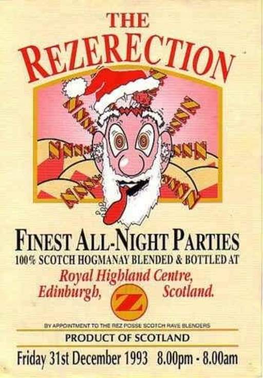
One of his posters – from a Disco Frenzy 90s night in Aberdeen’s Cotton Club – plays on the classic album cover for Sex Pistols’ Never Mind the Bollocks, Here's the Sex Pistols. Meanwhile, the poster for a 10,000-capacity Hogmanay party at Edinburgh’s Royal Highland Centre in 1998 is based on a whisky bottle. Famed for being the home of Bass Generator’s happy hardcore, the poster (below) depicts a frightening cartoon version of Father Christmas underneath the name of the event series, Rezerection.
Sci-fi Stereotype
Memories of early rave flyers will more than likely conjure up images of aliens, UFOs, and loved-up robots. Dance music’s wholehearted embrace of the sci-fi aesthetic was in part due to design trends at the time, but also because of the futuristic event experience that promoters were determined to sell. “In the early 90s, you would go to raves and there would be massive laser shows and people dancing on stage dressed as robots,” says Hagan. “So the sci-fi imagery was carried on in that way.” He nods to a droid on the poster for a huge Technodrome rave held on an Ayrshire farm in 1991, and the mysterious alien egg taking centre stage on the design for the Sweatbox opening night at Dundee’s The Venue II.
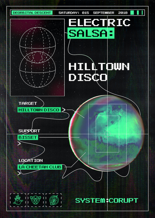
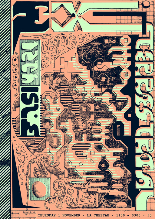
Fast forward a couple of decades and the futuristic, tech-heavy imagery was still around, although in more modern, subtle iterations. The design for the opening night of Inner City Acid – a night run by David Fleming between 2004 and 2009 in Glasgow – spells out the line-up in a digital-style font with an anaglyph image of the city’s skyline. Come the late 2010s, Paddy Hughes’ designs for Hilltown Disco – a record label and party collective born in Dundee – used textural layering and illustrations of transmitters to emulate a scene from inside a spaceship. Even an uber-sleek design by Russ Sealey, of Para Creative, for Terminal V’s 2019 The Rising event at the Royal Highland Centre plays on the cyberspace theme, with a neon globular cluster framing the event’s flashy line-up.
Talking with Typography
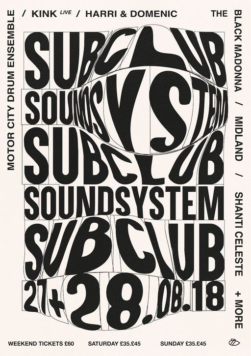
Although classic rave culture was famed for its maximalist flyer designs, the 2010s ushered in a new generation of designers who weren’t afraid to strip it right back to keep things fresh. Caterina Bianchini made a name for herself carving out the aesthetic for Sub Club Soundsystem by playing with the most basic of poster components – the text itself.
Inspired by anything from household packaging to contemporary artists like John Baldessari and Alan Fletcher, Bianchini would usually try to resist the urge to visually interpret the ‘sound’ of a night. “I wouldn’t be interested in making something look like a typical deep tech night, instead I’d make it really arty,” she says. Bianchini’s designs would always undergo a final edit to ensure the human alterations were obvious. “I liked adding little details that you won't necessarily see firsthand,” she says. “But when you come up close and really interact, you can see that maybe one of the As is upside down, or one letter is more squished than the others.”
Originally from Edinburgh, Bianchini landed a design role at Boiler Room in 2016 before going freelance for a variety of clients in electronic music. “I think that I kept doing posters for so long because of how expressive the work was,” she says. “It really allowed me to explore typography and my style came over time.” Bianchini now runs her own creative consultancy and branding agency in London, Studio Nari, and although no longer designing for clubs, she credits her grounding in posters for her fluid approach to current projects.
Cut and [cmd: V] Paste
Modernising the old school cut-and-stick technique, graphic generalist Connor MacDonald – also known as Sensory Works – usually works via digital collage. He started out making posters for his own club night, Contour, at The Reading Rooms in Dundee, before moving to Glasgow around 2018 and working for the likes of La Cheetah Club and The Berkeley Suite.
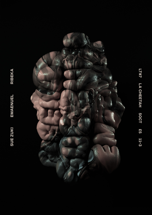
Despite using the same Photoshop collage technique, many of MacDonald’s designs look dramatically different. One might be hyper-realistic, while another resembles a children’s cartoon. A poster for a Ribeka show at La Cheetah Club in 2018 shows a floating 3D rendering of names on the line-up, all moulded into a huge smoker’s lung. “[Ribeka] was talking about the texture and tone of the music and I just took it in a very material way,” MacDonald says. “Everyone's names bloomed into weird organs, blown up and squashed together. There's very few rules in this space, which makes it really fun to play around in.”
One of MacDonald’s personal favourites is a design for a Bufiman show at The Berkeley Suite in January 2020, which was made using a cut-out of a flower painting from the Met Museum’s online collection. “There are hundreds of things that you can use for free, completely in the public domain,” he says. “No one's ever really doing much with them; they just sort of sit there being old bits of art. The whole thing is about referencing different things so that people have a really good idea when they see the poster of what the night is about just by the vibe.”
A Photoshop Affair
Edinburgh-based DJ, promoter and self-taught graphic designer Ryan Marinello is another artist using Photoshop to create his poster artwork. Prior to the pandemic he regularly produced posters for club nights at Sneaky Pete’s, including his own TEESH party series. Although his work may not always follow a concurrent theme or aesthetic, his designs somehow always manage to look distinctly his own. “I got into poster design because I started playing around with Photoshop in my spare time, making collage-type stuff just for fun,” he says. “I’ve been asked by other designers where I went to art school or how I do things, but I don’t have any way to explain it apart from I’ve spent hours playing around with a program.”
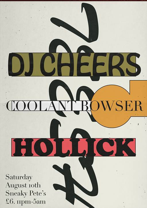
From rainbow colour fields to darker, graffiti-inspired type, many of his designs look so well-rendered and nuanced that it’s difficult to believe they were made digitally; but it’s all about building up components. Marinello approaches concepts in different ways, sometimes starting by placing a new font in the middle of a blank page and putting text and visuals around it, other times by recreating a vision in his head. “It’s hard to say when to stop adding to a design,” he says. “Sometimes I can spend over ten hours on one, sometimes it can be finished in an hour or two. You need all the necessary information there, then it’s sort of like getting dressed. You just know instinctively.”
Creating Characters
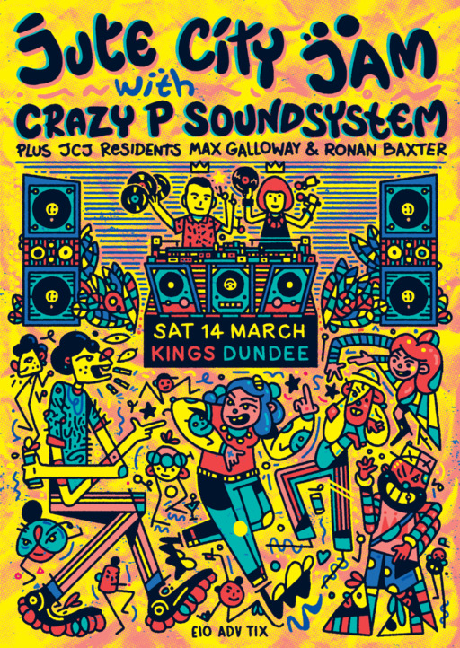
Derby-born Jacob Tomlinson has been designing posters in his signature style since 2011. Illustration heavy with numerous narratives and characters in conversation, Tomlinson describes his style as a weird blend of Keith Haring meets Where’s Wally meets Jamie Hewlett meets the Beano. He made his start drawing flyers for indie bands before picking up poster work in 2017 for Dundee house and disco night, Jute City Jam.
Tomlinson says that he is inspired just as much by people-watching in clubs as the music itself. “I get into a lot of characters and their interactions with one another,” he says. “I like making something that somebody can stare at, so that if you did have it on your bedroom wall you could look at it every day and maybe spot something new.” A quick glance below at his design for a Crazy P Soundsystem event at Kings in Dundee, which was cancelled just before the pandemic in March 2020, depicts a club scene with the infamous acid house smiley drawn into the middle of the speakers and a chaotic dancefloor of geometric cartoon clubbers.
Each design can take around 12 hours to make, and they are always born out of daydream-doodling. “It starts in the sketchbook, which is just a translation of my brain onto the page,” Tomlinson says. “Sometimes the promoter will ask me to include specific things, like the bouncers, then I usually draw it with a pencil roughly or draw directly into Photoshop before adding the colours digitally.”
Let’s Get Physical
For all of the advanced software out there, though, it’s impossible to recreate the effects of tangible media. Some contemporary poster designers still work solely in the physical sphere, or more than likely will manipulate original artwork using technology.
Glasgow-based artist Gabriella Marcella is best known as the founder and director of design studio RISOTTO, specialising in risograph printing. Marcella’s signature style can be seen on a 2015 poster for RIDE, a popular hip-hop and R’n’B night at Sneaky Pete’s which came to an end in 2019. The poster was made using risograph and a stencil print, achieving a soft overlayering of tones that just couldn’t be replicated using a printer.
Meanwhile, Edinburgh-based photographer Oliver McKenzie used ink, acrylic and collage to make the bold design for a 2020 Gramrcy set at intimate St Andrews party series, Wax Rooms. Unlike the text-heavy posters of earlier eras, the ability to disseminate event information separately online meant that it could focus on being an interpretation of Gramrcy’s headspace music using solely tangible media, before being photographed and transported into the digital realm.
And then there’s Al White’s mind-blowingly complex designs for the 12th Isle parties. “I use a lot of drawing and analogue techniques, especially in the first half of the poster-making process,” says White, who started off making posters in Glasgow in 2014. “I also use Photoshop, so for me it's about finding interesting ways to take things in and out of the computer and make something that sits somewhere in between. I screenprint a lot of the posters too, which adds another layer to the whole process.”
One of his posters for Concrete Cabin – a record label and club night playing drum & bass, grime, jungle, and hardcore – was made using spray paint and digital type, while his two-tone design of organic twisting structures for the last 12th Isle party at The Art School was made by working on top of a previous poster. “I then re-drew the isles to be decayed and demented from the hell we had put them through in that basement,” he says.
The prevailing urge to tamper with perfection, and to intrude on Adobe’s symmetry and sleekness with the human hand, is a recurring theme in the evolution of club poster design. It is art that is raw, colourful, loud, and chaotic. It's gloriously imperfect, and one of the most accurate visual reflections of nightlife that we have.
Image credits, top to bottom: Wendy Helliwell, Paul Hagan, Paddy Hughes, Caterina Bianchini, Connor MacDonald / Sensory Works, Ryan Marinello, Jacob Tomlinson, Al White
This article is the final part of our series platforming emergent writers, produced in partnership with Edinburgh International Festival
Follow Chiara Wilkinson on Twitter @chiarawilkinson