Local Heroes: Kate & The Ink
As the world begins to feel a little brighter, Local Heroes turn their attention to the sunny designs of Kate Dowling, aka Kate & The Ink

It’s spring and little pinches of colour are beginning to poke their way through the ground, bringing some much-needed happiness and optimism with them. As our thoughts turn to spring cleaning and rearranging the homes that we have become very familiar with over the past year, we speak to Kate Dowling about her sunny and bright design business Kate & The Ink where she designs useful, bold, colourful products with a nod to retro design eras.
Dowling studied product design at the Glasgow School of Art and, after having her son in 2016, started her own design business that could work around childcare and being a new mum. She launched her range of greeting cards, notebooks and art prints and is stocked in gift shops like Paper Tiger in Edinburgh, Sunshine No.1 and Braw Wee Emporium in Glasgow, Oklahoma in Manchester and Pencil Me In in Elgin.
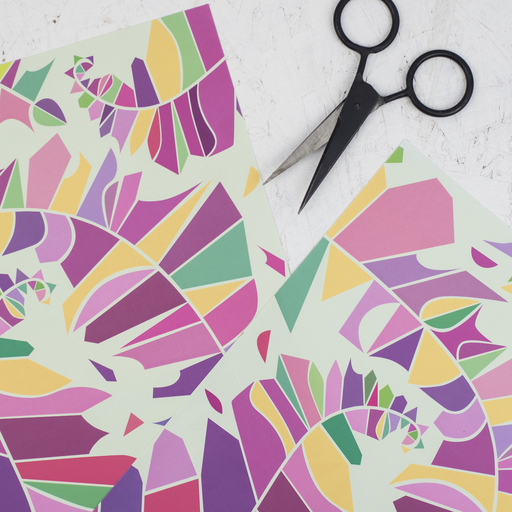
Her new colour block range includes two tea towels, greeting cards and some art prints that have been inspired by 80s and early 90s fashion, print and pattern design.
“I also love the colour and imagination in some children's cartoons like Hey Duggee (my son is 4.5 so I pretty much dream in Duggee!) I love the simple, clean vector graphics and definitely take inspiration from their design style. This year, almost unintentionally, my focus has been to create clashy, happy prints which brighten up our homes. When I started these designs, my sketchbook was almost screaming, ‘I just want to make people smile!’ (In less of a sinister way than that sounds!)”
Dowling’s continual hunt for design problems to solve led her to her best selling meal planner design. “Changing our shopping habits in lockdown and having to be more organised got me started on a magnetic fridge planner with a perforation down the middle. It seems that other people want to think ahead about what they eat, be organised while also maintaining style in their kitchens.”
Bauhaus and Memphis are two design styles that the Edinburgh-based designer comes back to regularly. “I’m attracted to the simple colourways and abstract shapes. Being an 80s child, I think Memphis in all its asymmetric, colourful glory is fabulous. I would love to dabble more in other homeware products inspired by these styles.”
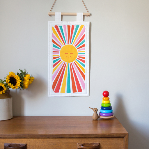
She also loves nostalgic references and this year worked with a local seamstress to design and make a quilted wall hanging of a retro sun. “I wanted to create a piece with modernist / bohemian vibes and these have proved to be super popular for kids’ rooms and reading corners. My ‘UK Shipping Areas’ chart (designed after years of hearing my dad listening to the shipping forecast) has been one of my best-selling designs.
“As I grow my small business, ultimately I want to stay loyal to my original inspiration: retro design, bold colour and usefulness. I hope that my products brighten up lives, whether that’s a wall hanging on a wall or a card received through the post. I would also love to help people channel their own creativity through colour and pattern.”
kateandtheink.com
Follow @kateandtheink on Instagram, Twitter and Facebook
Sun photo by Clare Bowes; pattern photo by Holly Booth