The Beautiful Game: Martin Duff on football and graphic design
We talk badges and banners with graphic designer and lifelong Scotland supporter Martin Duff
Martin Duff appears on screen kitted out in a Scotland top, obviously. Our transatlantic call finds him in Massachusetts, where he’s participating in the Tartan Army’s takeover of Boston’s streets, bars and hearts. Now, Duff is no part-time cadet, he’s been to over 100 Scotland matches in the last twenty or so years, mostly with his dad. At the time of our conversation, he had watched Scotland beat Haiti 1-0, with Morocco and Brazil still to come.
While in Boston, Duff has found himself staying in his old university halls, where he lived during an exchange year from Edinburgh College of Art. “When I was here last time, I was 21, the furthest away I’d been from home, and I could not have felt further away from Scotland. This time I’m here and there are 10,000 Scotland fans standing outside the art school in kilts, with bagpipes.”
After graduating in Edinburgh, Duff completed a few stints in local agencies before founding Faith Studio in 2019, an independent graphic design consultancy in Glasgow. Specialising in brand identity, packaging and print design, his personal and professional love of the game has also drawn him increasingly into the space where sport and design meet.
“Why do I love football? Whoa, that's existential,” he says, looking out the window to the tartan filled streets below. “I think what’s so beautiful about it is that you don’t need loads of equipment or facilities to play it. Jumpers for goalposts is the common phrase. You just throw your jackets down, you’ve got two sets of goals, and you can play.
“It’s interesting to contrast that with what’s happening at the World Cup now. You need a $100 train, a $16 beer, a $30 hot dog and a $500 seat.”
He suggests that football is – usually – one of the world’s least gatekept sports, at least to play, with its accessible simplicity spanning languages, cultures and politics. In fact, the variety in style is what makes it interesting, and some argue that those who’ve cut their teeth on concrete develop skills that perfect pitches can’t replicate. For example in 2022, Palmeiras’ youth academy in São Paulo deliberately introduced a dirt training pitch to recreate the uneven and unpredictable conditions of Brazilian street football. The stated aim was to encourage improvisation, autonomy, agility and creativity, qualities coaches feared were being lost as young players trained increasingly on perfect surfaces.
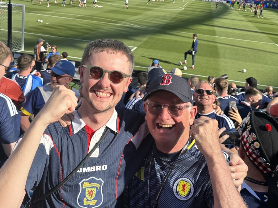
Martin Duff and his dad in Boston. Credit: Martin Duff.
This authenticity can be seen in football’s design styles too, evident in the banners, signs and flags currently being carried from Boston to Miami. “There're people who probably don’t even know what graphic design is, but they’re laying out flags and thinking: where does the name go, where does ‘Tartan Army’ go, and what do we do with it?” explains Duff. “They’re not produced by the club or the national team. They’re made by the fans, handmade.”
As a designer, Duff doesn't mind the ‘bad’ design, uneven lines or poor typesetting. “If it was perfectly kerned and beautifully printed with foil embossing, it would ruin it. It wouldn’t be the same thing,” he shares. “It almost takes the soul out of it. Football is perfectly imperfect, and the design reflects that.”
This need for authenticity causes a dilemma for the professional designer, something Duff is acutely aware of when he is designing for the game. “Fans absolutely hate when their club rebrands. These people have ancestral ties to football clubs going back generations, so there is real meaning there.”
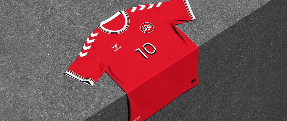
Recently, Duff found himself creating speculative designs for Greenland’s national team, in response to their attempt to join CONCACAF, the regional confederation governing football in North and Central America and the Caribbean. Careful not to pretend he could define their culture from the outside, his approach was to research and develop from what already exists. “You don’t want to place meaning or culture on someone, because that’s not your responsibility.”
Using the Greenlandic flag as his starting point, Duff carried its simple divided-circle form into the crest and typography for the team. Greenland’s landscape creates a unique league schedule, as travelling between regions, often not connected by road, can be expensive and weather dependent. In 2025, the national championship finals were played across 20 matches in 6 days in Nuuk. Duff framed the team’s identity around this sense of community and perseverance, with the line ‘Onward as One’.
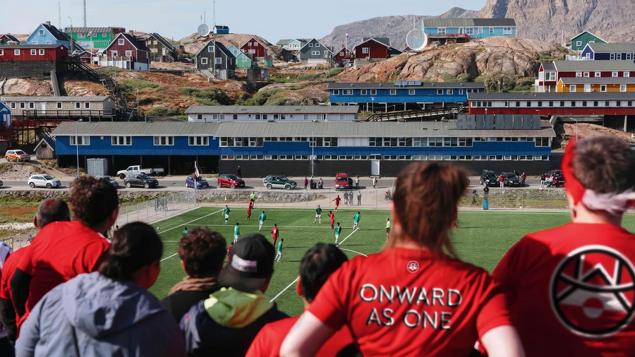
Spec designs for the Greenland national football team. Photo courtesy of Martin Duff
Duff describes the real test of successful football design as a bucket list moment, and dreams of the day he sees a crest tattoo of his own design. “That’s a proper seal of approval: you’ve done such a good job that someone is literally going to put it on their skin.”
As for good examples, Duff praises Tottenham’s 2024 rebrand by Studio Nomad. He describes it as a strong example of walking the line between heritage and contemporary design. However, that didn’t stop them from finishing one place above the Premier League's relegation zone that year. “You can have the best football design in the world, but if the team is complete and utter shit, you can get humbled very quickly.”